A brief glossary specific to design terms that you'll see throughout the Raccoon Store
Colour Modes
There are two main colour modes that you will come across in design, CMYK (for print) and RGB (for Web).
CMYK
CMYK refers to the four basic colour system used in printing (cyan, magenta, yellow, and black/key). All print files should be set up in CMYK.
RGB
RGB refers to a 3 colour model (Red, Green and Blue) that is used in web-based design and optimised for screen resolutions. A design created using the RGB model will not look the same when printed as it would on screen.
TIPS:
- If you are creating a logo for both print and web uses, always produce your design in CMYK first to avoid a colour difference in your print compared to your screen display.
- Convert a colour is a useful tool for converting HEX and RGB codes to CMYK.
- Adobe has a useful help centre that shows you how to set up your illustrator project in CMYK.
File Types
There are a wide variety of file types which can be confusing when designing for print and web – which file formats are best? Below is an explanation of some of the most common design file formats and which are best suited to printing.
PDFs are an industry standard. They maintain a consistent view of your file no matter what software was used to create the design, which is why they are the ideal way to send your artwork files for print.
TIP:
PDF's are our prefered file type. To ensure we can meet lead times please send your artwork as a PDF.
JPG
JPG is a widely compressed image format for digital images. It is common in digital cameras and on the web. JPG's are subject to a loss of image quality when they are scaled up to larger sizes. When using a JPG file in a design that is going to be printed, 300dpi is usually a good resolution to aim for to ensure that the final print won't look blurry.
PNG and GIF
GIF and PNG files are a lossless format for images and can be animated and stationary images. They are often used online but are unsuitable for print.
TIFF
A TIFF is a large raster file that maintains its quality when scaled up. The file uses lossless compression so is suitable for when you want to include a digital photo in your design.
Note:
You can use a variety of these files within your artwork. If a design is only being used for small prints, a slightly lower resolution might not matter. Raccoon will always be happy to help advise you throughout the printing process.
Fonts
There are two main categories to choose from when picking a font:, Serif or Sans Serif. Although there is no right or wrong font to choose, there are certain characteristics within each of the font styles that tend to favour certain types of brands.
Serif
Serif fonts have decorative strokes at the foot of each letter. They are seen as traditional and convey well-established qualities. Serif fonts are often easier to read in printed materials such as books, and newspapers. Examples of brands that use these fonts include The Times, Rolex and HSBC.

Sans Serif
Sans serif fonts have no decorative strokes. They are seen as clean, modern and approachable, making them a good fit for companies who want to appear fresh and original – such as tech companies. Sans serif fonts are easier to read on websites and on larger printed materials. Examples of brands that use these fonts include Facebook, Pinterest and Netflix.

In short, there is no right or wrong font for your brand and designs, but styles should be considered when thinking about the message you want to convey.
Image Types
There are two main types of images that can be created for print. Vector and Raster below we detail out the distinct differences between the two and highlight the benefits of a vector image.
Vector Images
- Vector images are created using geometric shapes that allow the image to be re-sized according to usage, without losing any image quality.
- Logo's and other designs that are likely to be printed or displayed in different sizes should be created using vector software so that they can be re-sized to fit on anything from a small die-cut sticker to a large vinyl banner.
- Vector images are normally created using design-specific software such as Adobe Illustrator or our own online design tool.
Raster Images
- Raster images are made up of pixels, and each pixel has a specific colour value.
- The downside of using raster images when printing is that they are resolution-dependent. This means that when you re-size a raster image, the pixels will be stretched/shrunk, resulting in a blurry image.
- Raster images can be created using software such as Adobe Photoshop or Canva.
Raster images blur when the size is Vector Images can be scaled to any size increased. without blurring.
TIP:
You can use the software on our website to create your own design [link to an article on using our design tool here]
Print Guidelines
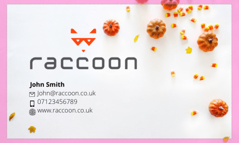
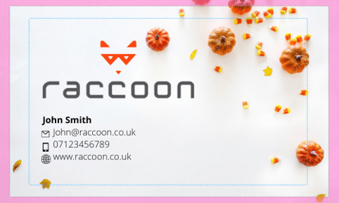
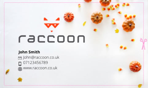
Setting up your design for print correctly is extremely important to achieve the results you want. Below we explain three of the most important things to consider; Safe area, Trim line and Bleed area.
Trim line
The line where the printer will cut the image. This will be the final size of the image.
Bleed area
The area beyond the trim line that ensures the print goes to the edge of your design.

Safe Area
The border inside the trim line that contains all printable text.
TIP:
Always extend your design to the edge of the bleed area. This will ensure that when your design is trimmed to the cut line, the design will extend right to the edge of the material.
Resolution
Within design and print, resolution refers to the number of pixels in an image. This is measured using DPI or Dots per Inch. The resolution of an image refers to the density of the pixels (or DPI) that constitutes it. At high resolutions, the image is crisp and vividly detailed. If the resolution is decreased or the image is “blown up” too much, it loses detail and the blocky squares of the pixels become noticeable.


Here is an exaggerated example of a hi-res image (left) and a lo-res image (right).
TIP:
Before you create your artwork it’s important to note that while an A3 poster ideally requires 300dpi resolution images, a much larger billboard print can actually be created by using the same resolutions but artworking at a tenth size. Check out this article for more information on how to determine the correct image resolution for your use.
Still need help?
If you still need help, please fill out our Contact Us form and a member of our team will be in touch.
